Lettering on a Street Sign or a Shopfront: Two Jobs, Different Priorities
Street sign and shopfront lettering serve different readers: learn how distance, movement and purpose shape type, spacing, contrast and placement.
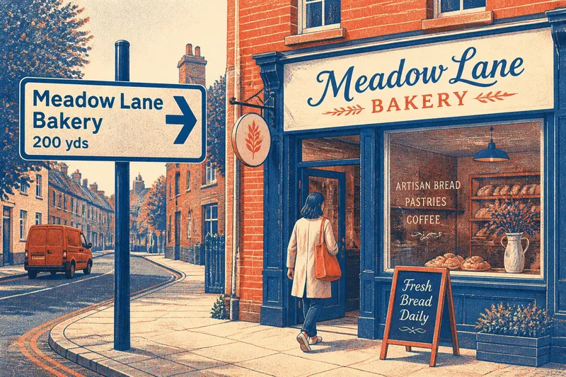
Street sign and shopfront lettering solve different reading problems: one helps someone choose a route, while the other identifies a place worth approaching. Distance, movement and purpose determine how each should look, so copying a shop’s expressive letters onto a directional sign—or making every shopfront look like a road marker—can work against its use.
What does a directional sign need to do?
A directional sign must communicate a specific choice quickly. A driver, cyclist or pedestrian may have only a brief glance to recognise a destination, distinguish it from nearby names and understand which way to go.
That puts legibility ahead of personality. Letterforms should be recognisable at a glance, with clear counters—the open spaces inside letters such as “a” and “e”—and shapes that remain distinct from one another. A narrow, highly decorative face can turn a place name into a blur when seen from a moving vehicle.
Hierarchy helps the reader sort information without studying the sign. The destination or route should attract attention before secondary details, such as a street number or supplementary direction. Arrows need to sit close enough to the words they govern that nobody mistakes which destination they indicate.
What does shopfront lettering need to communicate?
Shopfront lettering has a broader role. It names a business, but it can also suggest what kind of place it is and invite a passer-by to look more closely. A florist might favour gentle, crafted forms; a repair shop might choose sturdy, plain lettering. Those choices help set expectations before anyone enters.
Unlike a directional sign, a shopfront is usually read from several distances and angles. Someone across the street may need to spot the name, while a person at the door may read opening details. Window lettering, a hanging sign and a fascia can divide those jobs rather than force every message into one block.
Expression still needs a readable foundation. A distinctive script can suit a short name, but it may struggle with a long business title or small contact details. Pairing expressive display lettering with a simpler supporting face keeps the identity characterful without making practical information difficult to find.
How do distance and pace change letter choices?
At a distance, small gaps and fine details disappear first. Open letter shapes, generous spacing and strong contrast help words hold together across a street. A sign that looks elegant close up may lose clarity if its strokes are thin or its letters sit tightly packed.
Pace changes what a reader can process. A person walking can pause or glance again; someone driving needs a short, instantly recognisable message. For that reason, a directional sign generally benefits from concise wording and restrained styling, while a shopfront can support more nuance because the reader can choose to linger.
Think of the difference as a label on a moving parcel and a nameplate beside a front door. Both identify something, but the first must register in passing while the second can reward a closer look.
How should contrast and placement differ?
Contrast is the difference between letters and their background. Dark lettering on a light surface, or light lettering on a dark one, can make forms easier to separate, but the surrounding conditions matter too. Glare on glazing, deep shadows, busy brickwork and passing traffic can all compete with the words.
Directional signs are commonly placed where a reader can see them before reaching the decision point. Their text and arrows need a clear relationship, and nearby signs should not make the intended route ambiguous. Shopfront lettering is tied more closely to the building: a fascia, window or projecting panel can each be visible from different approaches.
Check the lettering from the places people will actually encounter it, not only from directly in front. For a shop, that might mean looking from the opposite pavement and then from the entrance. For a directional sign, consider the approach path and the moment when a person must act.
How can one design serve its readers?
Start by writing down who needs to read the lettering, where they will be, how quickly they must understand it and what they should do next. Then choose type and placement to suit those conditions. If the sign has several messages, decide which one matters most before adjusting size or colour.
Say a fictional bakery sits on a side street, and its owner wants both passing visitors and delivery drivers to find it. The owner could use an expressive name on the shopfront, where pedestrians can approach and read it, while a separate directional sign uses a plain face, a clear arrow and the bakery’s name. The expected result is that the shop keeps its character while the route information remains quick to scan.
For a real sign, check applicable local requirements and the sign or surface manufacturer’s instructions where they affect lettering, placement or materials.
Which lettering questions come up most often?
Should a street sign use the same typeface as a shopfront?
It can, if the typeface remains clear at the sign’s viewing distance and suits its purpose. A shared face can connect the signs visually, but a simpler or heavier variant may be more suitable for a route decision.
Is larger lettering always easier to read?
Not by itself. Size helps, but cramped spacing, weak contrast or an unfamiliar letter shape can still slow recognition; assess the whole word from the reader’s likely viewpoint.
Can decorative lettering work on a shopfront?
Yes, especially for a short name that people can approach and inspect. Keep secondary information in a more straightforward style if customers need to read it quickly or from farther away.
What should be checked before choosing a sign layout?
Check the message, viewing direction, likely pace, background and decision point. A layout should make the intended name or instruction stand out without relying on a reader to stop and puzzle it out.
How can you judge the lettering before it is installed?
Make a rough mock-up at the intended proportions and place it against a photograph of the actual building or approach. View it at the distance and angle relevant to its job, then ask someone unfamiliar with the wording what they notice first. If they miss the destination, misread the arrow or cannot distinguish the shop name, revise the hierarchy, spacing or contrast.
Street sign and shopfront lettering can share a visual language, but they should not be forced into identical solutions. Design each for the moment its reader encounters it: a quick decision in motion, or an invitation to stop and look again.